Company: QUIETON Oy
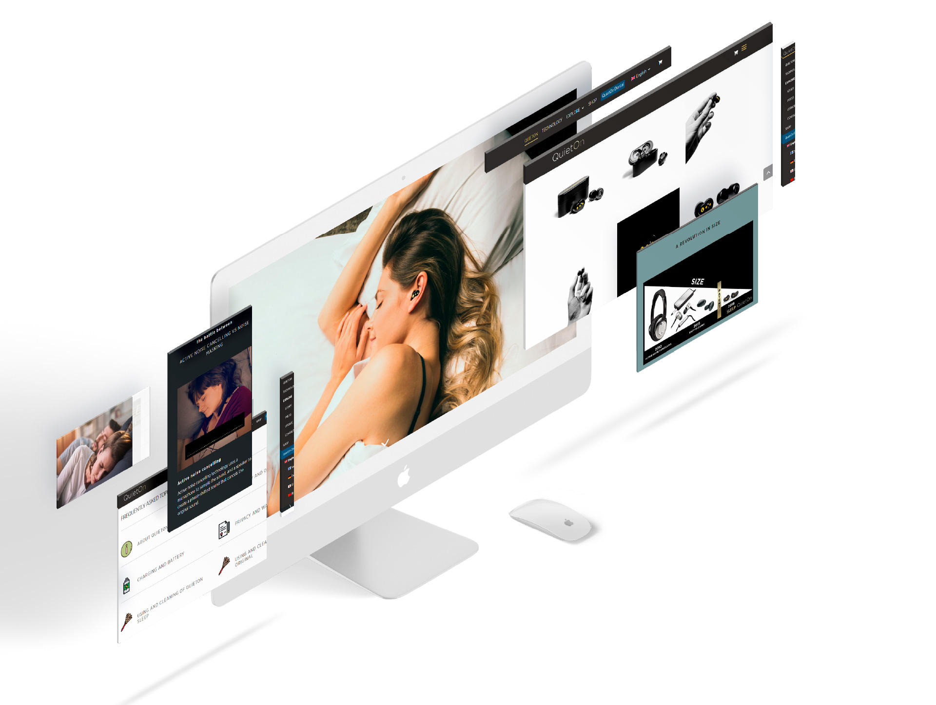
Brief background information: The first version of the website was good enough to provide basic information to the customers during the early days of the startup, however, after the crowdfunding round, a more informative site with better user experience is required to boost the sales.
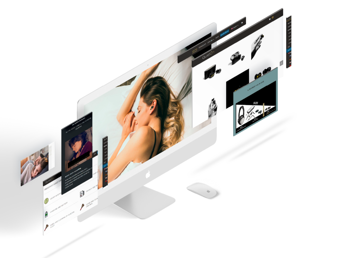
Goal: To understand the potential customers and design a new version of the website that can help reduce the bounce rate and improve the online-sales through the company’s webshop; and at the same time, enhance the brand image and identity with the new visuals.
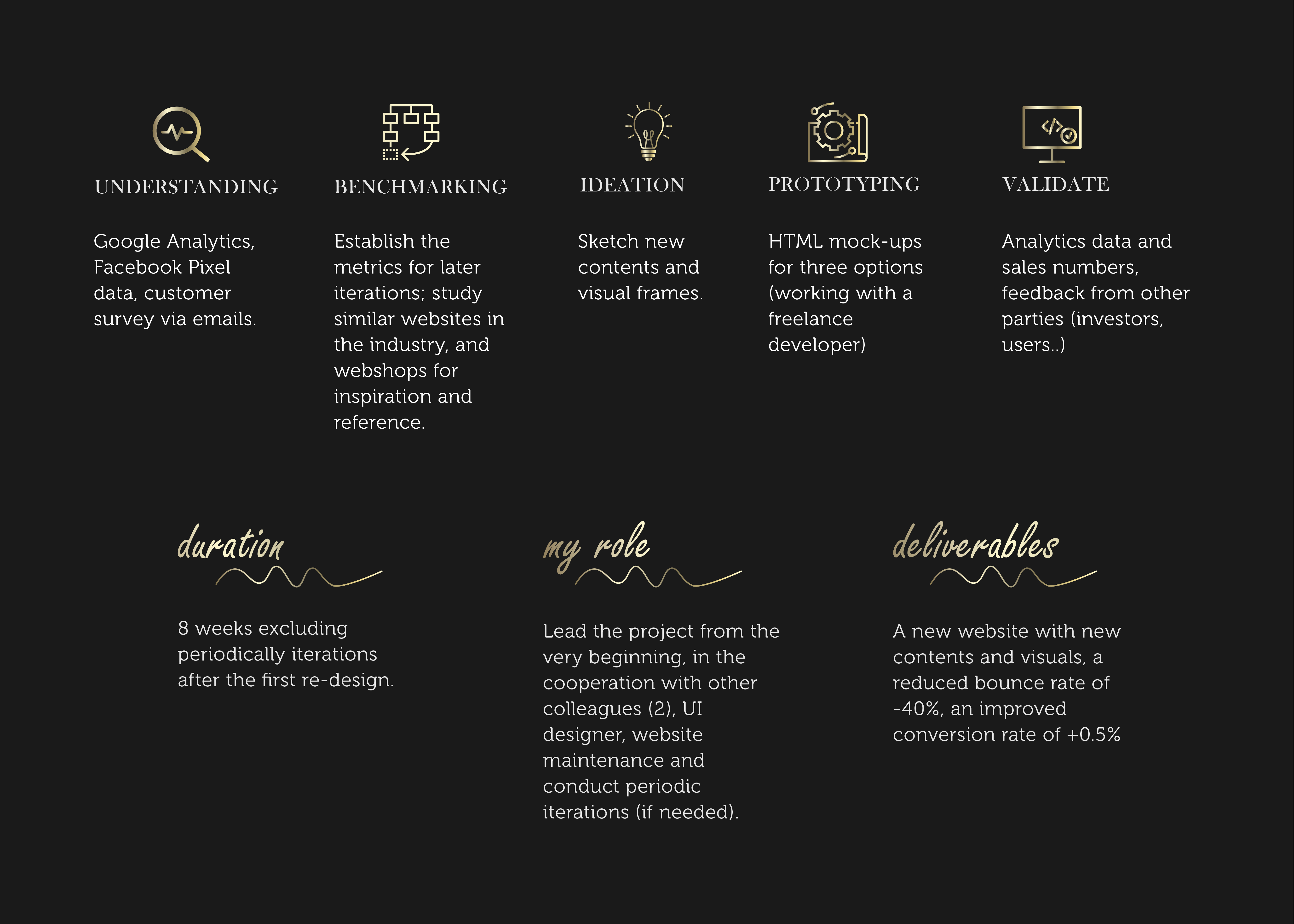
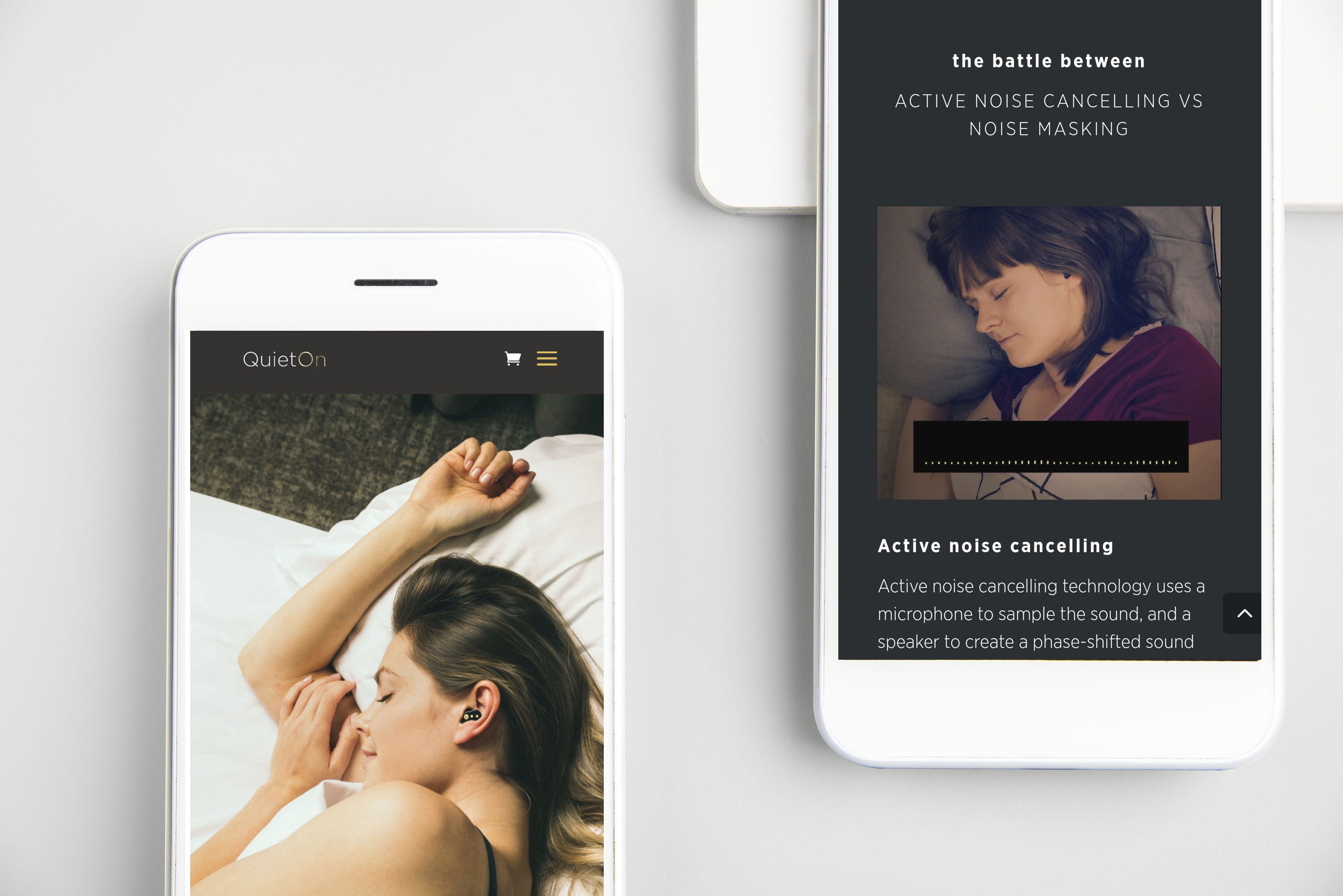
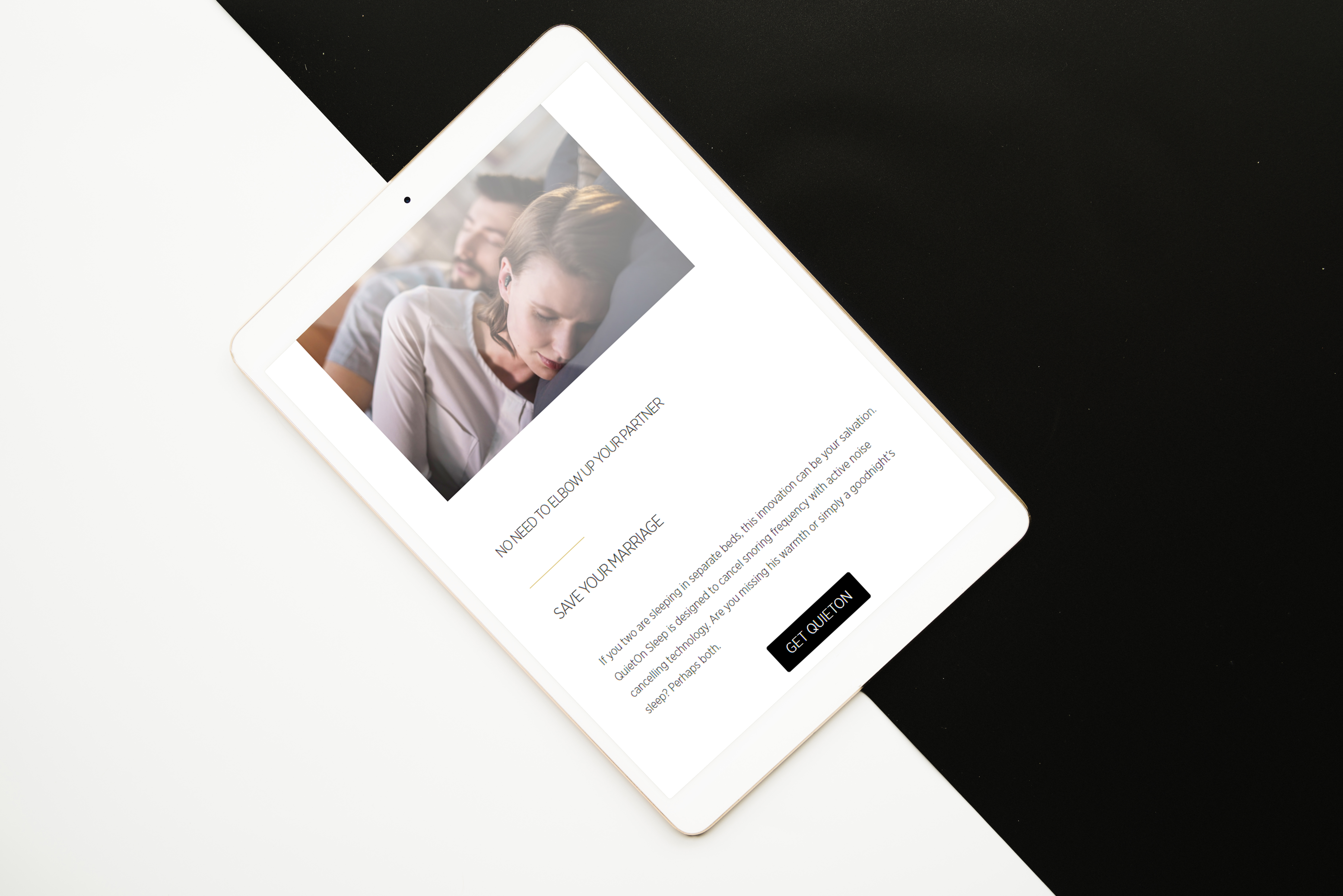
Result: A newly designed website with more information was completed within 2 months. On-site user experience is also improved. The bounce rate is reduced 40% and online sales increases 0.5%. For more details, check the process at the end of the page.
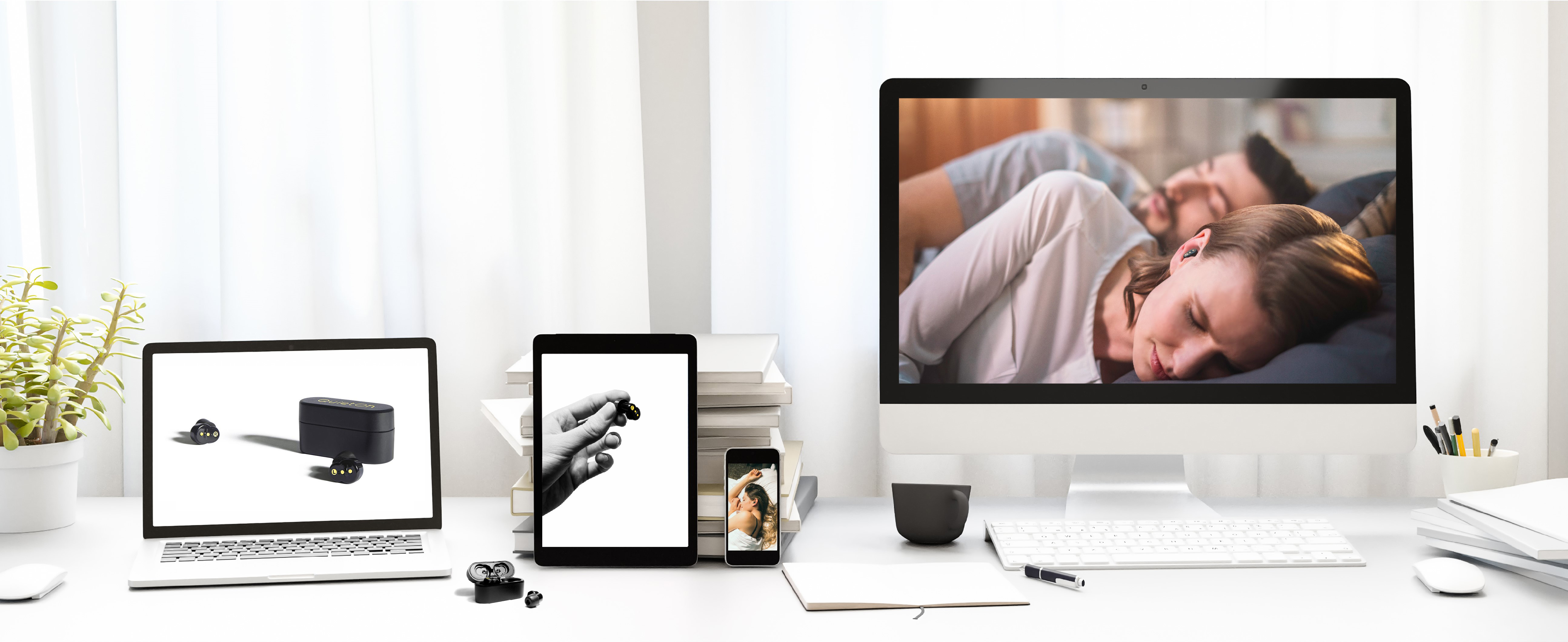
NEW BRANDING VISUALS
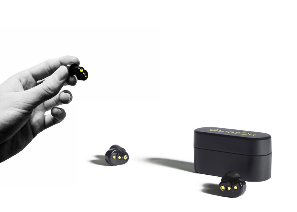
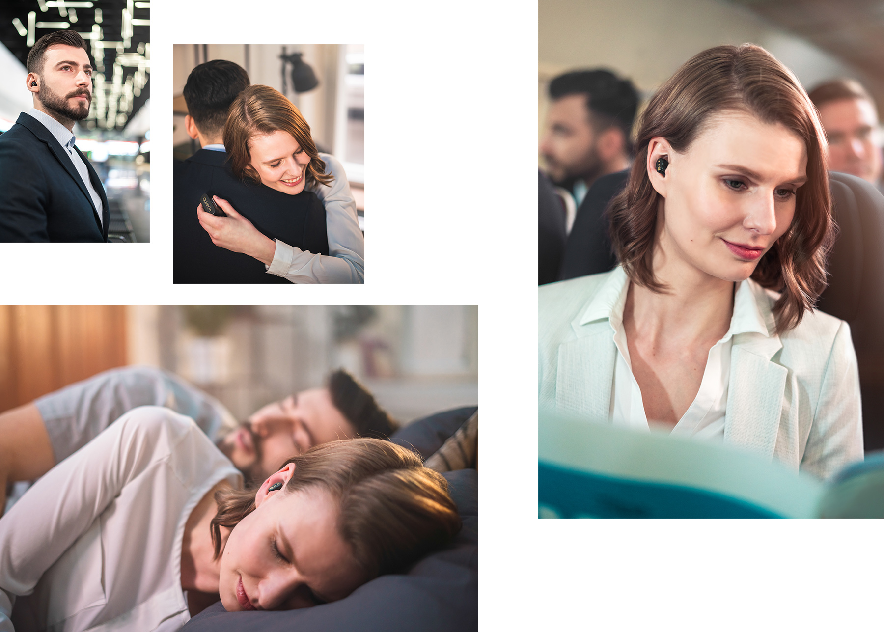
Other ground work: Besides the re-design of the website, I direct the new visual creation process by crafting the concepts and working with a local agency to create new images, videos, etc.
