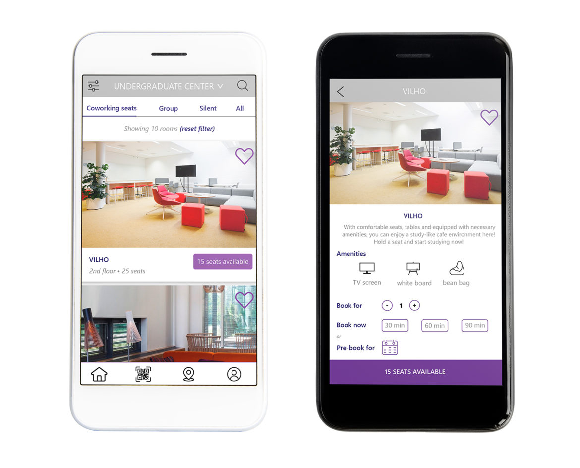
A brief introduction of Aalto Space app & ITP program:
Finding available spaces for studying, group work or meetings in the Otaniemi campus area can be challenging. Aalto Space is a mobile app that helps students find and quickly reserve available study locations. The app can be used to find and book several predefined spaces for study and group work for students. Moreover, Aalto Space offers other opportunities to communicate with students, such as an emergency messaging feature that allows Aalto’s communications department to send notifications about emergency situations within the campus area.
Aalto University Information Technology Program (ITP) brings students together from diverse backgrounds and all around the world to solve digital business problems. ITP enables individuals to combine business, design and technological perspectives, making it an ever changing and valuable education module. The program helps students deepen understanding of information technologies, service design and digital platforms. Students can also gain valuable project work experience in international and multi-disciplinary teams.
The project at a glimpse:
This project, in cooperation with ITP program, wants to figure out: How are the students using the app now? What could improve their user experience? Based on the findings, the ultimate goal is to make sure the students can book a room, navigate the campus and utilize the infrastructure to its full potential, while enjoying an engaging and interactive customer experience, which leads to increased room ratings and feedback.
However, in the scope of the project, Aalto Space and Team Dali agreed that the three following deliverables are to be accomplished: customer profiles; UI mockups of the new features or improvements of current features, and proposal for tutorial of app usage.
First and foremost, a thorough understanding of app users is crucial before conducting any next steps to improve the user experience. Customer profile is the first deliverable in this project. Even though there are different segments of app users, upon the discussion with Aalto Space staff, students are prioritized as the main targeted segment that the app aims to provide superior user experience. The project will start with user research to be able to understand this segment’s behaviour. Data sets provided by Aalto Space will be coded and analysed to examine the most popular behavioural patterns. Besides, in-depth interviews of focus group will be done to investigate how users are using the app. Based on the findings in customer profiling, Team Dali proposes the next steps in improving the current features or adding new ones with UI mockups.
These prototypes will be validated with the focus group. The validated ideas are finally developed into UI mockups, which is the second deliverable of the project. Communication plan regarding the tutorial for using the new features is the last deliverable for the project.
Methodology & Process:
Various methods are utilized in the project to collect data, process data, and developing prototypes or mockups, such as focus group interview, thematic content and narrative analysis, storyboard sketching, ect. Agile model is applied in this project with different loops of iteration for testing ideas, prototypes and mockups.
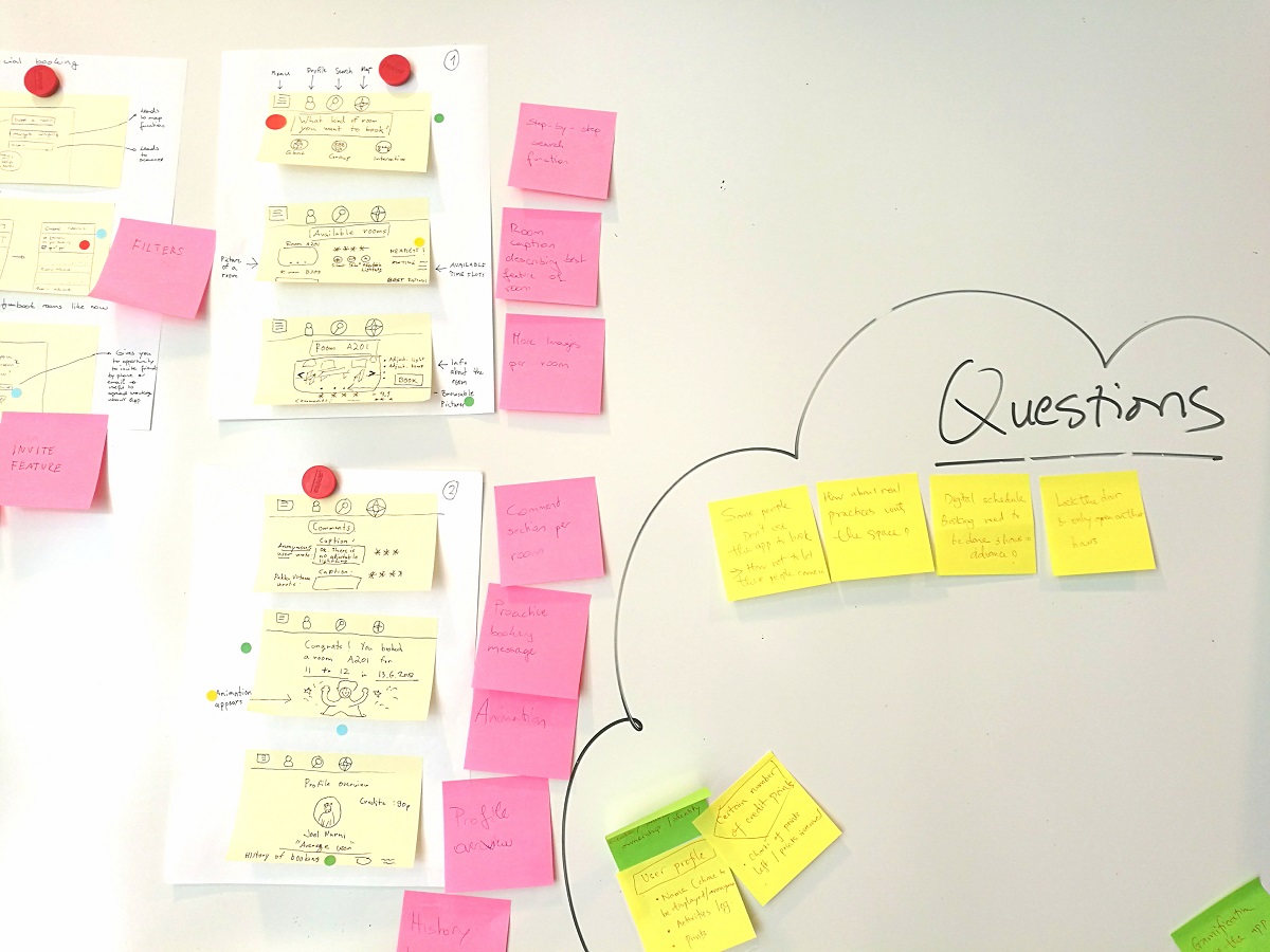
brainstorming
The team had a clear vision that our prototype would need to be more intuitive for the users and our goal was to reduce the clickings and add visibility. The process of doing prototypes and validation is iterative. We have developed 4 prototypes before the final one. Below are some of the very first prototypes:
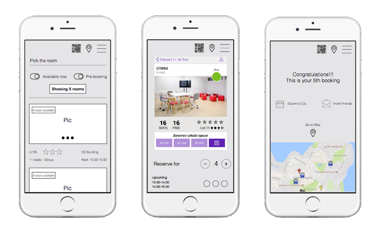
The prototypes are validated through usability testing with the focused group and different UX methods such as heuristic testing, SUS (system usability scale) score.
Deliverables:
UI mockup of the app. Keynote, Illustrator, and Invision were tools used to develop the prototypes and mockups.
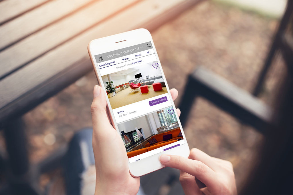
Home page view of the app
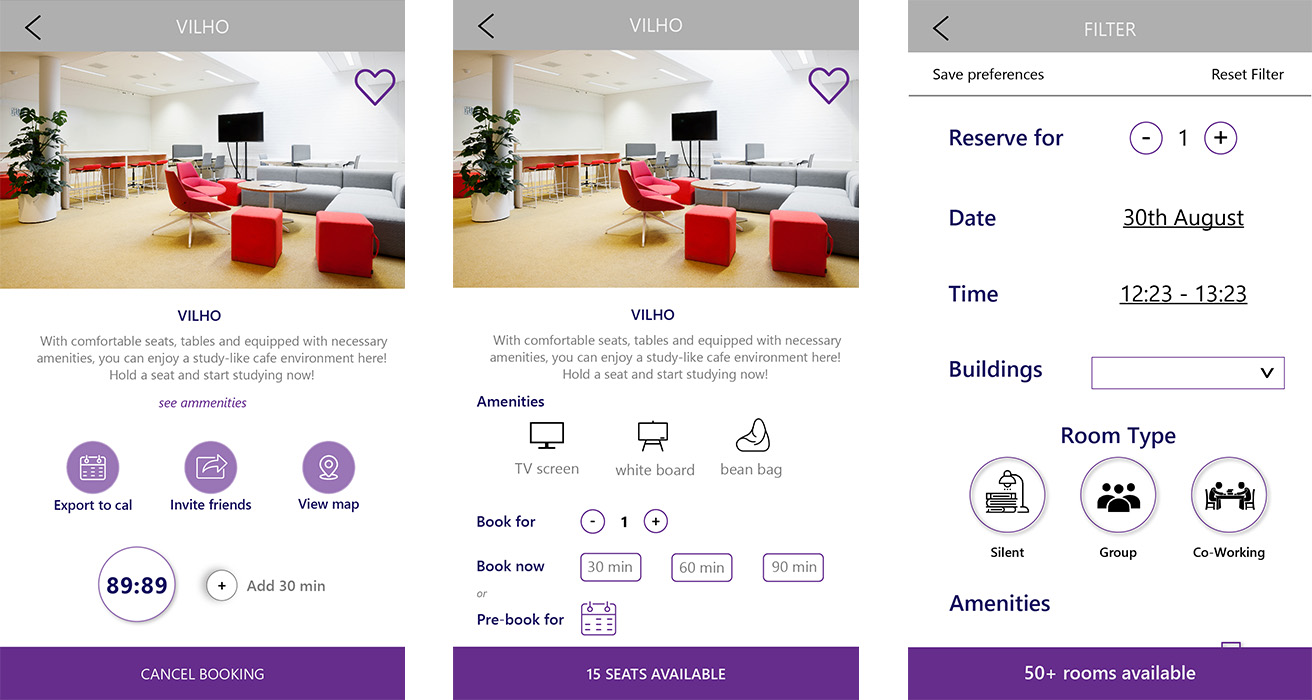
With these improvements from the original app’s UI, users can clearly see how many seats available, amenities of the room and can easily add more time for their booking slots. Filter feature is redesigned with smoother flow for better user experience.
My roles in the project & Challenges:
At the early phase of the project, I was in charge of doing user research by designing the questionnaires, interviewing the users and observing them while they were testing the prototypes. It was rather challenging because the sample was so small that the feedback was various and couldn’t be categorized into groups. However, the more the project progressed, the more users our team could gather. Finally, we were able to form 4 groups of users who use the app. Our clients were very satisfied with the results.
Besides, with my strengths in design, I made the first mockup with Illustrator from the sketches and drafts made by Keynote.
