Brand campaigns and branding are different.
In the age when big brands are throwing millions of dollars on ad campaigns during Super Bowl, buying fancy spots at the airports, or covering a majority of digital landscape, where is the stage for small brands and start-ups and what’s their currency to get their messages through?
It’s a sum of lessons learned from myriads of A/B testings and customer listening sessions. Perhaps.

As many startups, QuietOn set out its journey with two engineers. The very first branding materials were quickly done for exhibitions and the first crowdfunding campaign which successfully raised 1.3 million USD. However, the demands from customers are different during a crowdfunding campaign from a launched start-up. The brand image needs to be polished and the brand itself needs revamping through time.
I was lucky to join its branding journey from the very beginning. The first effort in enhancing the brand image started with redesigning the website. I worked directly with the founders and one more colleague to complete the first version after two months. The website’s bounce rate was reduced by 42% and online sales increased 0.5%. The current website is the second version after the first change was made.
The perks of being small is how agile you can be in trying out various ideas. Fail, fail fast and learn. Different tests were done through Facebook advertising and Google ads campaign to examine what worked and what didn’t, from visuals to copies. Further, working with small and mid-tier bloggers to write reviews for the product proved to be effective with respect to content marketing and search engine optimization. QuietOn shows up on the first SERP (search engine result page), such as low frequency sound, sleep, etc.
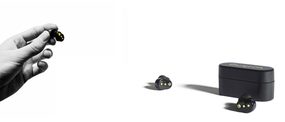
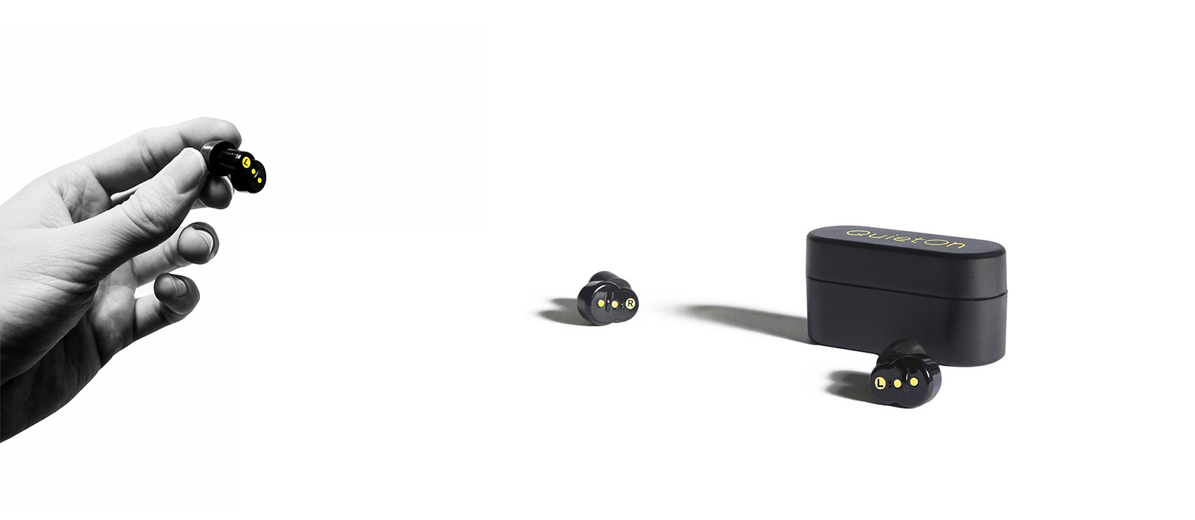
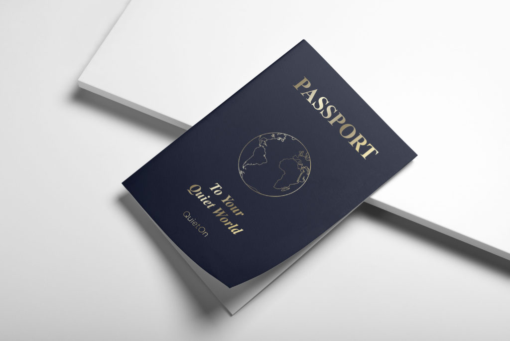
Besides brand messaging that evolves, branding visuals are under crucial transformation as well. They have to reflect the core values of a Nordic’s health brand: elegant, minimal, peaceful and hi-end.
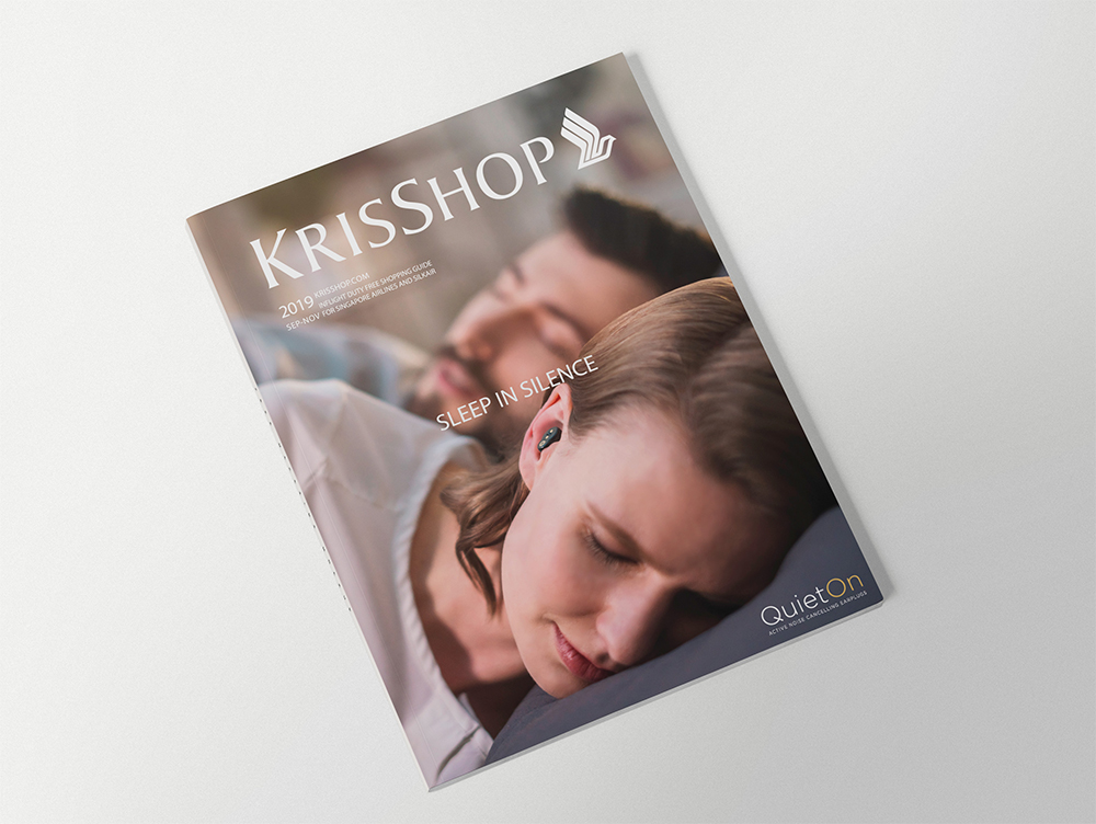
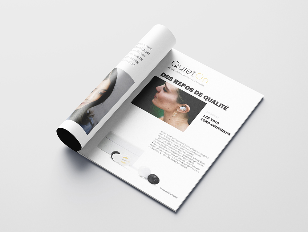
Below are some of the brand’s new visuals: product images, brochure, in-flight magazine advert & cover. I was in charged of designing and creating new branding visuals in cooperation with the founder.
Branding is not only the work of the marketer, it’s the sum of continuous efforts of the whole team, from the visions of the founder, to the hardwork of the customer service team, and the product training from the engineers. Every touch point counts when it comes to a B2C brand.
