When I came up with this business’s name, I thought of the Lego concept. Lego can create an infinite ability to build things. In a similar fashion, the same magic can be done with layers and letters, we can create myriads of cool things, from a poster, magazine advert, website to beautiful poems.
I asked a friend of mine to make me some drafts using Lego pieces.
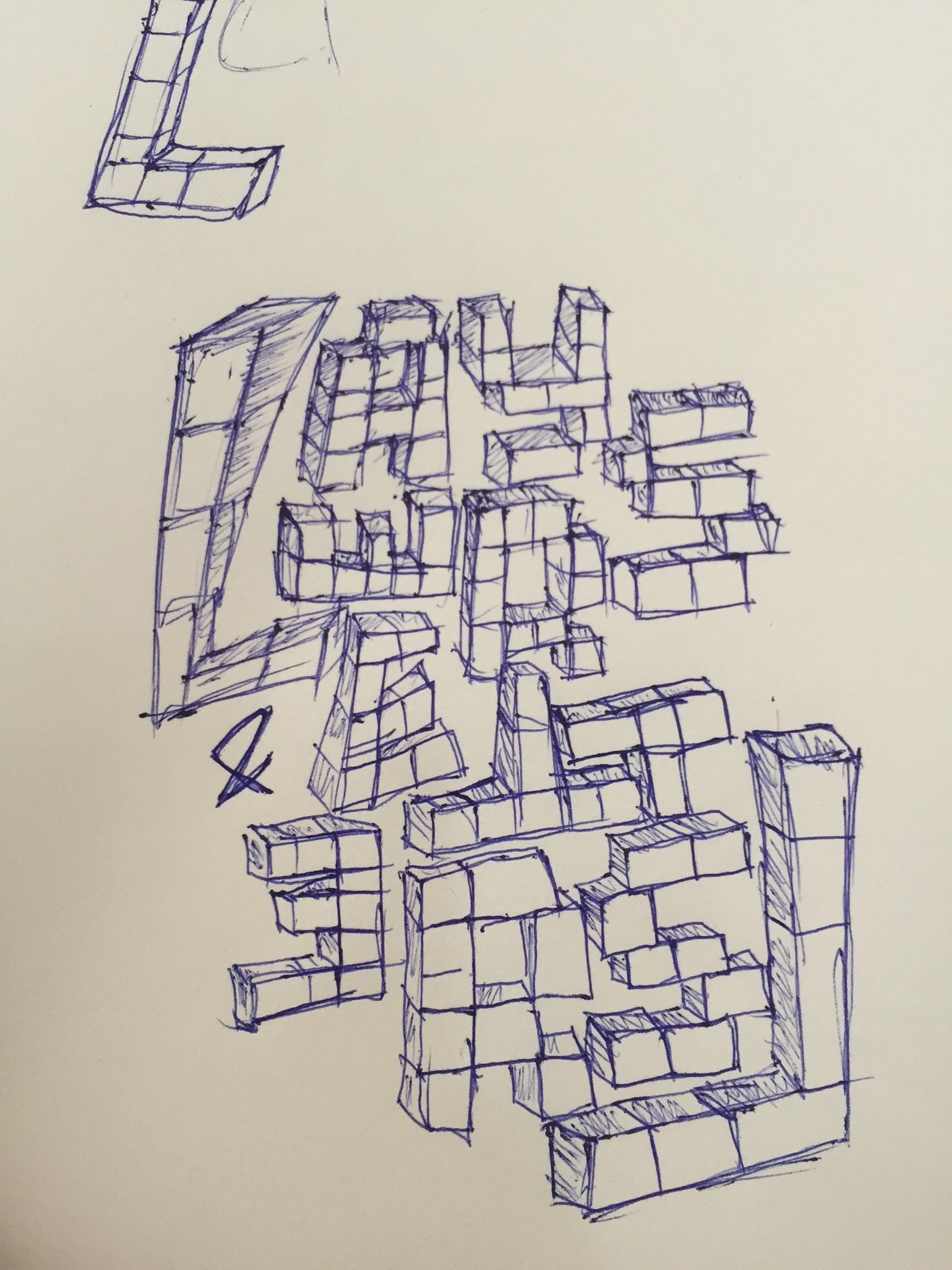
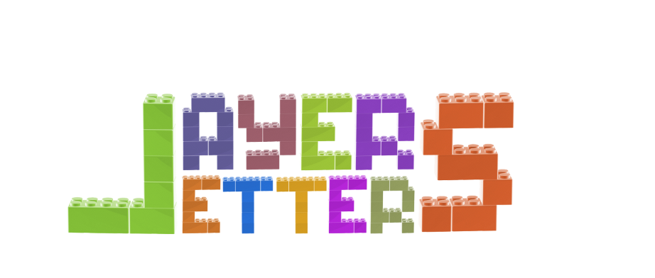
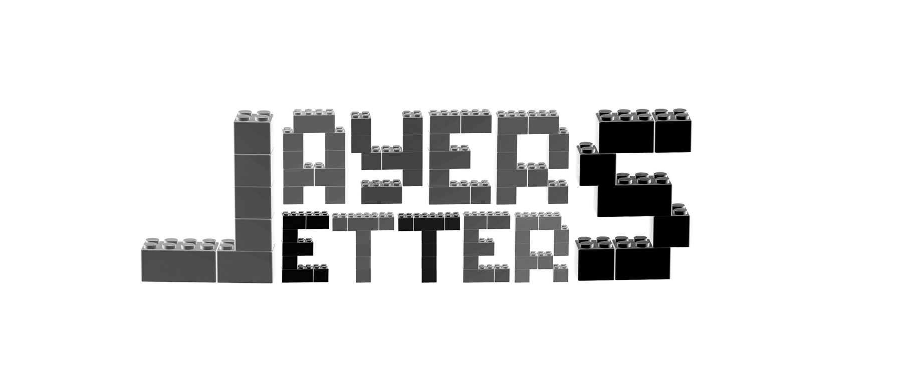
The concept is there and I can think of some little animation for it to make it cooler, but somehow it doesn’t go well with the whole website’s design.
I then tried with Adobe Effects for some fun animation.
Yet this is a bit too much to be put on the top of the front page.
Where is my logo then?
I am still experimenting with these and hopefully soon enough, I will get my favorite version live. Before that, I’ll keep making some more drafts. Fail and learn.
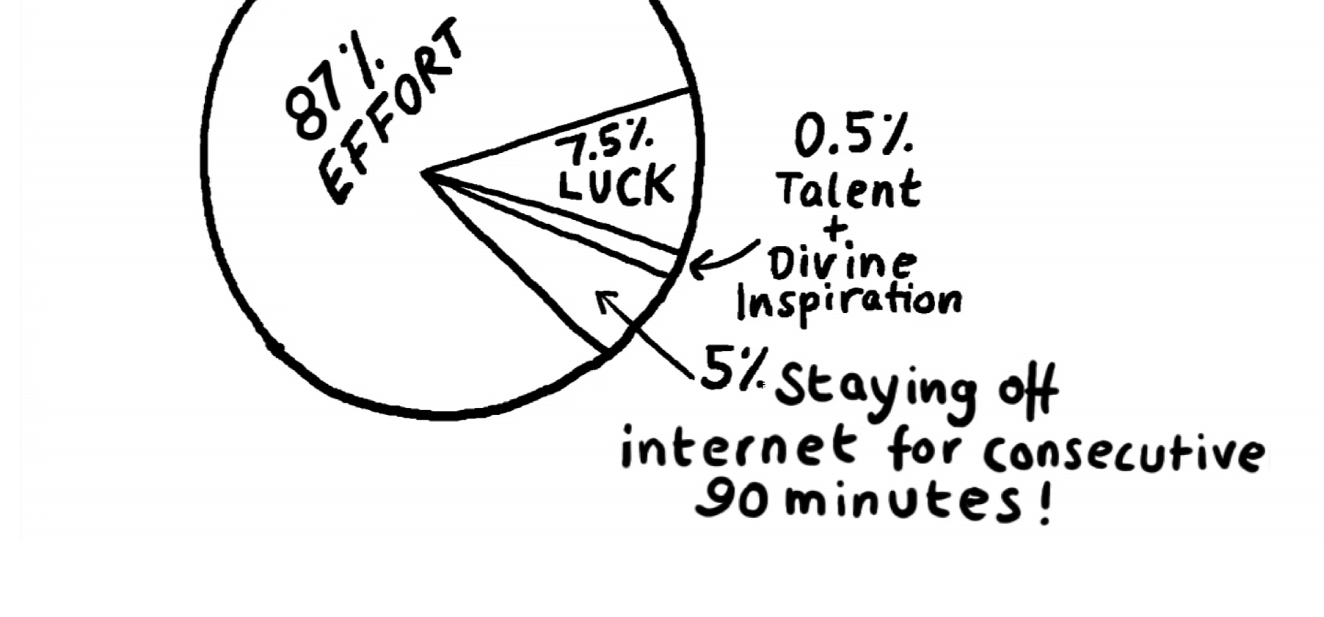
Sponsor for my motivation to keep trying is Christopher Niemann’s illustration on finding good ideas and executing them:
This week, I continued experimenting with some more forms of the letters in my logo. Can letters be in letters, as when you design, there’s this clipping mask?
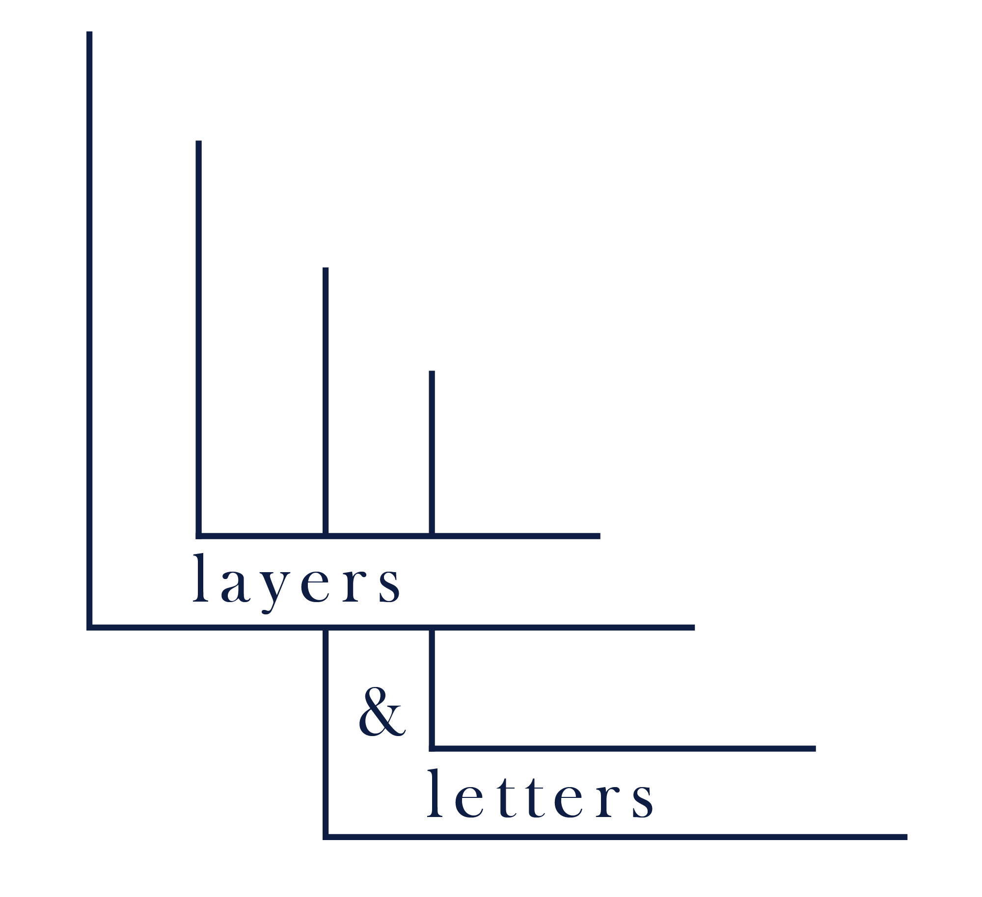
I then added a little tweak with a variety of lengths in letter L’s parts, aligning all of them on an invisible diagonal edge.
This has some certain improvement but doesn’t get to the point that can express how I want the layers and letters to be combined in a logo. The next day, I tried out something else. I remember once my teacher aka previous boss told me “Get all ideas you have in mind out onto the papers. That’s the only way the new ideas can come in”.
In the new version, I added a bit of color as an accent to the logo. The idea of interlocking two letters Ls is inherited from the previous version, but the logo’s name is written separately, creating a curve that makes half of the moon (invisibly).
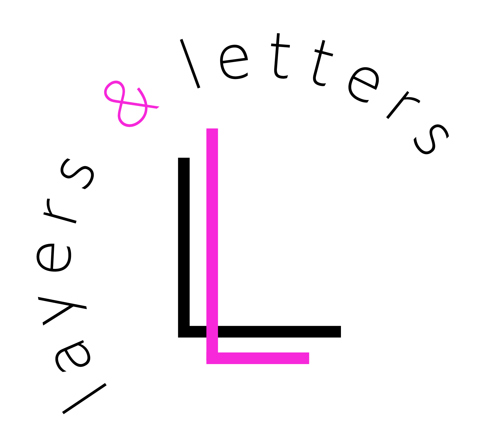
I am quite happy with it for now. In my imagination, there are a lot of cool animations that can be done with this logo, but I’ll keep it simple first. Experiments can always be done.
What’s “Layers & Letters”?
To me, it’s the ability to be flexible and adjustable.